There is often a case for improving the understanding of things with visualisations.
Python provides a number of libraries to create great visualisations – however they often focus on a data science approach – scripts and jupyter notebooks.
What we want is the visualisations to be easily accessible through a django website.
That is what I will be showing in this post with a specific focus on network diagrams.
What Visualisation Package are we using for the Network Graph
I have tried to find a few packages for creating a network graph:
Comparison
I will be using graphviz and networkx for very simple rudementary network graphs. You can make them look good but it is strenuous effort.
I will let you try networkx, plotly igraph and Diagrams on your own.
Graphviz
Graphviz was very simple output and input. Not too much fuss and can render in many formats. To create a simple graph displayed on the frontend as an SVG:
from graphviz import Graph

g = Graph(
    'G',
    format='svg',
    engine='twopi',
)

g.node('root', shape='rectangle', width='1.5')
g.node('red')
g.node('blue')

g.edge('root', 'red', label='to_red')
g.edge('root', 'blue', label='to_blue')

context_data['my_chart'] = g.pipe().decode('utf-8')
Display on frontend:
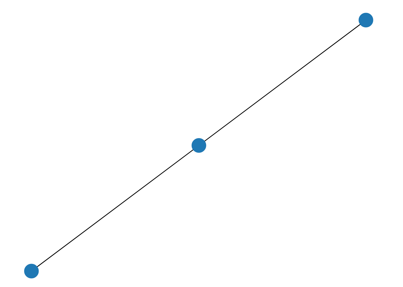
{{ my_chart | safe }}The image output:

NetworkX
NetworkX is not primarily a graph drawing package but basic drawing with Matplotlib as well as an interface to use the open source Graphviz software package are included.
The networkx plot is drawn using matplotlib (it can also use graphviz) to draw.
    import matplotlib.pyplot as plt
    import networkx as nx
    import io

    G = nx.Graph()

    # rectanle width 1.5
    G.add_node('root')
    G.add_node('red')
    G.add_node('blue')

    # label: to_red
    G.add_edge('root', 'red')
    # label: to_blue
    G.add_edge('root', 'blue')

    nx.draw(G)
    buf = io.BytesIO()
    plt.savefig(buf, format='svg', bbox_inches='tight')
    image_bytes = buf.getvalue().decode('utf-8')
    buf.close()
    plt.close()

    context_data['my_chart'] = image_bytes
Display on frontend:
{{ my_chart | safe }}The image output:
No annotations…
Make sure you close the plot otherwise it will cause issues, matplotlib is not thread safe…
Important:
nx.draw(G)– draws with no labelsnx.draw_networkx(G)– Draws with labels

Conclusion
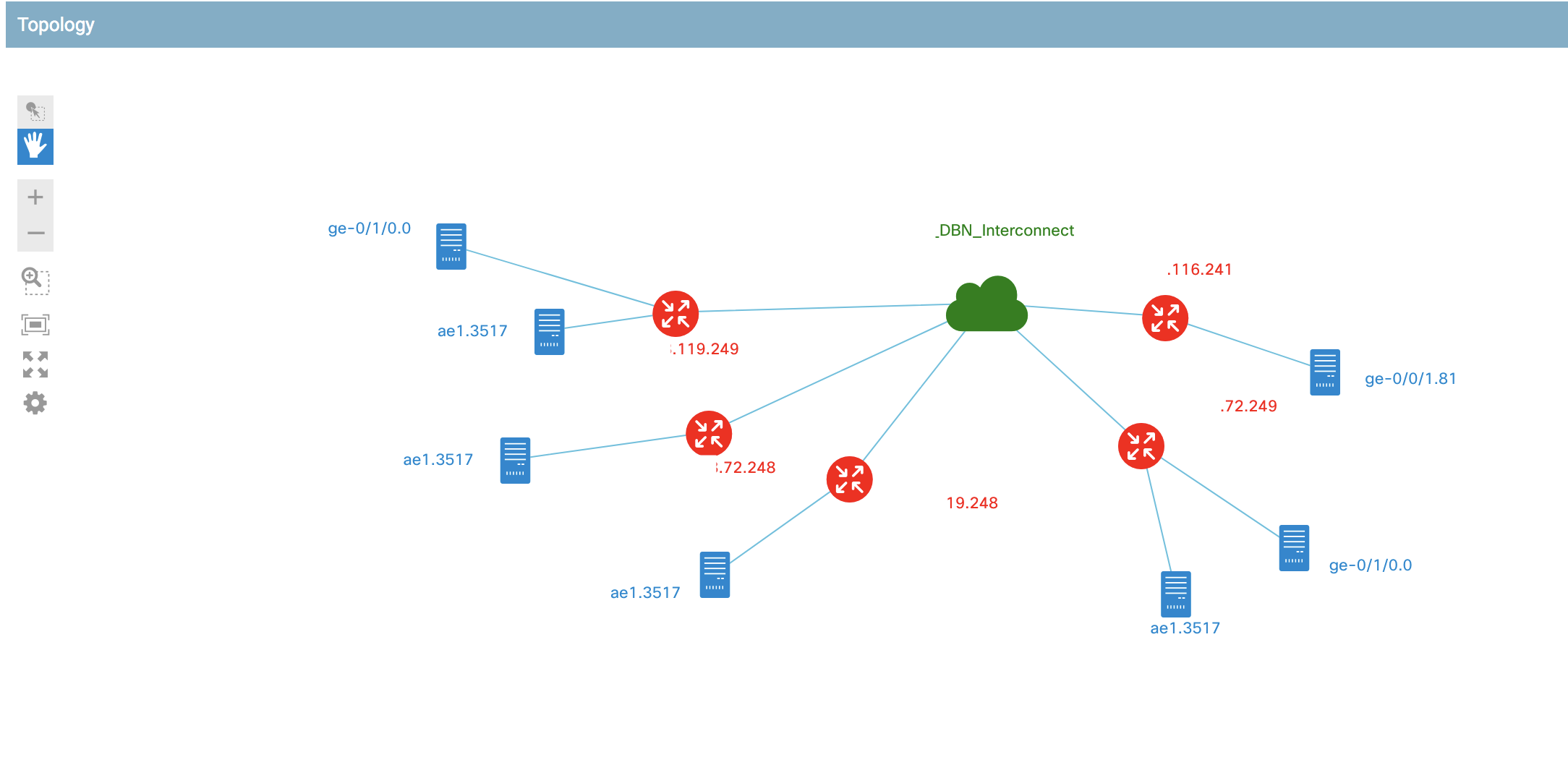
Although these charts can serve the purpose I started wrangling with the javascript library for network diagrams called Cisco NextUI.
Here is an example of the results: